
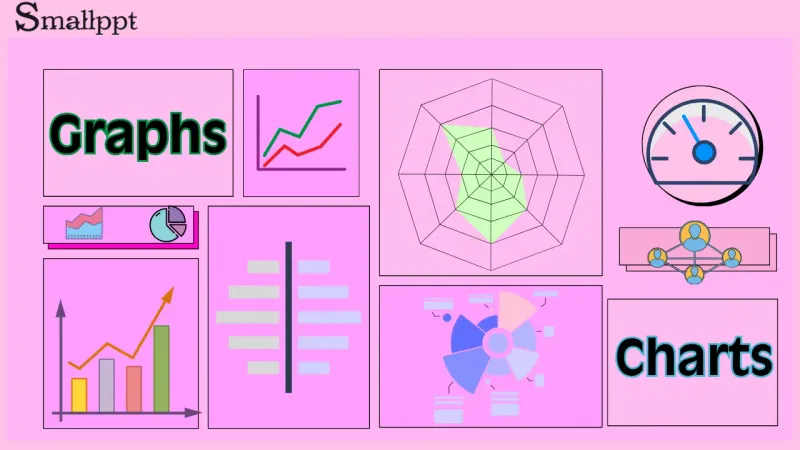
A graph is a visual representation of data. They use visual elements like points, lines, bars, and pie charts to present data, turning raw numbers into visuals that are easy to understand, helping you spot patterns and trends.
Charts are one of the most common forms of data visualization. They refer to graphics that use points, lines, bars, or sectors to display data and trends. You can think of a chart as a tool for telling a data story. They turn complex data into clear visuals, helping users quickly spot trends, make comparisons, understand composition, and recognize relationships. Charts usually include axes, legends, and data labels in a clear, structured layout.
In practice, people often confuse graphs and charts, not knowing which one is suitable for a particular scenario. Next, let’s explore when to use each.
Chart vs Graph: Main Differences
Charts and graphs are often used interchangeably in everyday language, but in professional contexts, there are subtle, sometimes important distinctions between them.
The core purpose of a chart is to display and communicate, making data easier to understand. The core purpose of a graph is to depict and analyze relationships, revealing objective mathematical or logical relationships between variables.
Let’s break down the main differences.
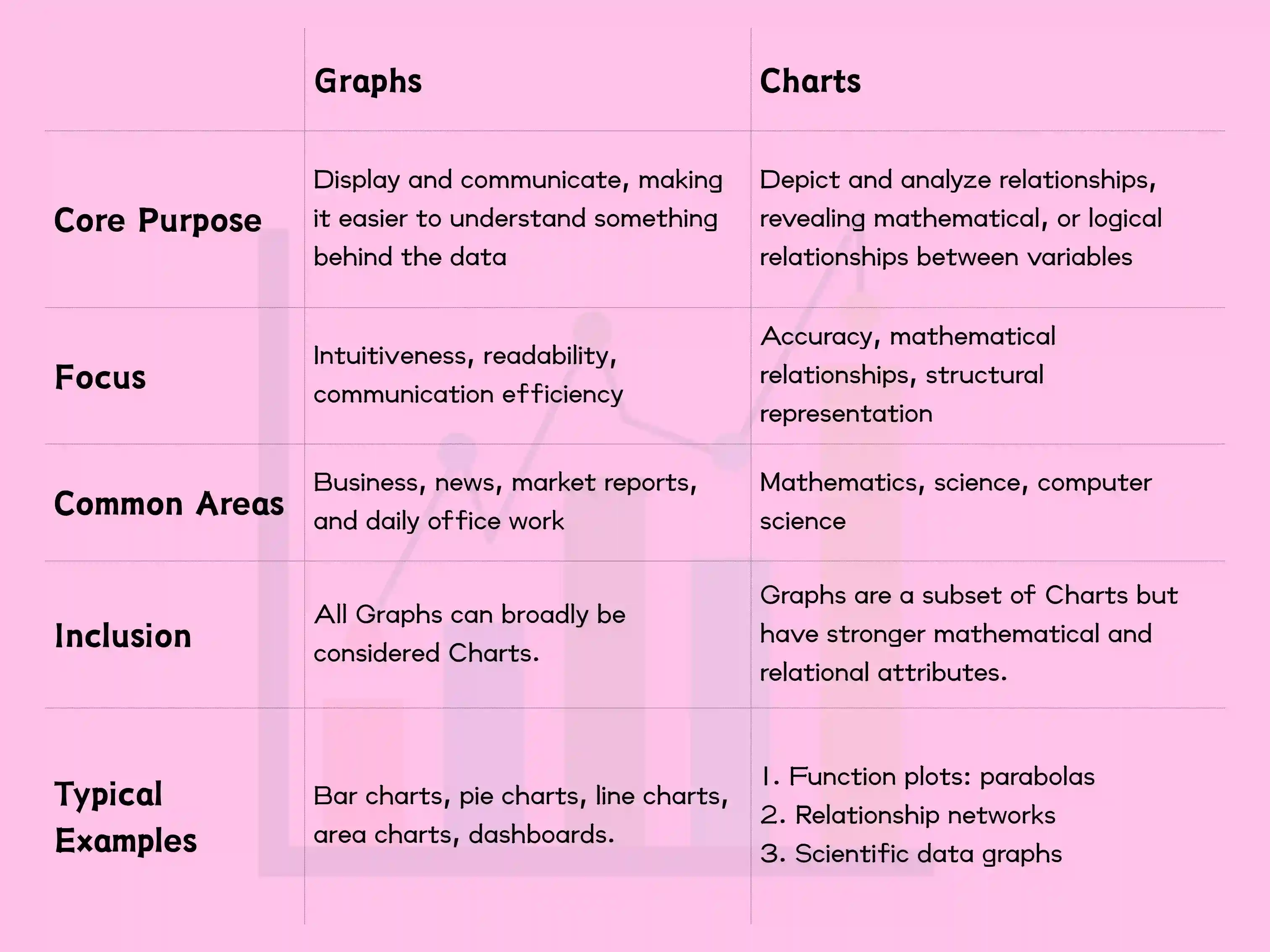
In business contexts, the line between charts and graphs is often blurred. However, a chart is more commonly used in business contexts. When discussing mathematical functions or scientific data visualizations, a graph is more accurate and scholarly. When discussing networks, network connections, or relationships in computing, a graph is the correct term.
You can call all graphs charts (especially in informal settings), but not all charts are appropriate to be called graphs, particularly when involving mathematical relationships and graph theory.
When to Use a Chart
Use a chart when your goal is to communicate, report, explain, or persuade a business or general audience. Typical scenarios include business reports and presentations, news and media, and financial dashboards. If your content involves terms such as reporting, presenting, marketing materials, or explaining to non-technical people, use a chart.
Here are some typical examples.
Business reports and presentations
Scenario: Reporting quarterly sales to management.
Use: Bar charts to compare the performance of each quarter; line charts to show growth trends.
Why: The goal is for them to grasp the business performance within 30 seconds.
News and media
Scenario: Reporting census results.
Use: Bar charts to compare populations in different cities.
Why: Enables ordinary readers to quickly grasp the key information.
In the office, use the word chart when speaking with your boss or colleagues—it’s the safest and most appropriate term. Chart is a more general and communication-focused term, covering most everyday applications.
When to Use a Graph
Use a graph when your focus is on research or data analysis, algorithm development, or representing complex network relationships. Common cases include scientific or engineering research, computer science & graph theory, statistics and data analysis. Use graphs when keywords like algorithms, graph theory, network models, or correlation analysis are involved.
Here are typical examples:
Molecular Structure and Bioinformatics
Scenario: Chemical molecular formulas
Usage: In chemistry, atoms are considered vertices, and chemical bonds are considered edges.
Why: The structure of a molecule (the structure of its graph) directly determines its chemical properties. By analyzing molecular graphs, the properties of new compounds can be predicted.

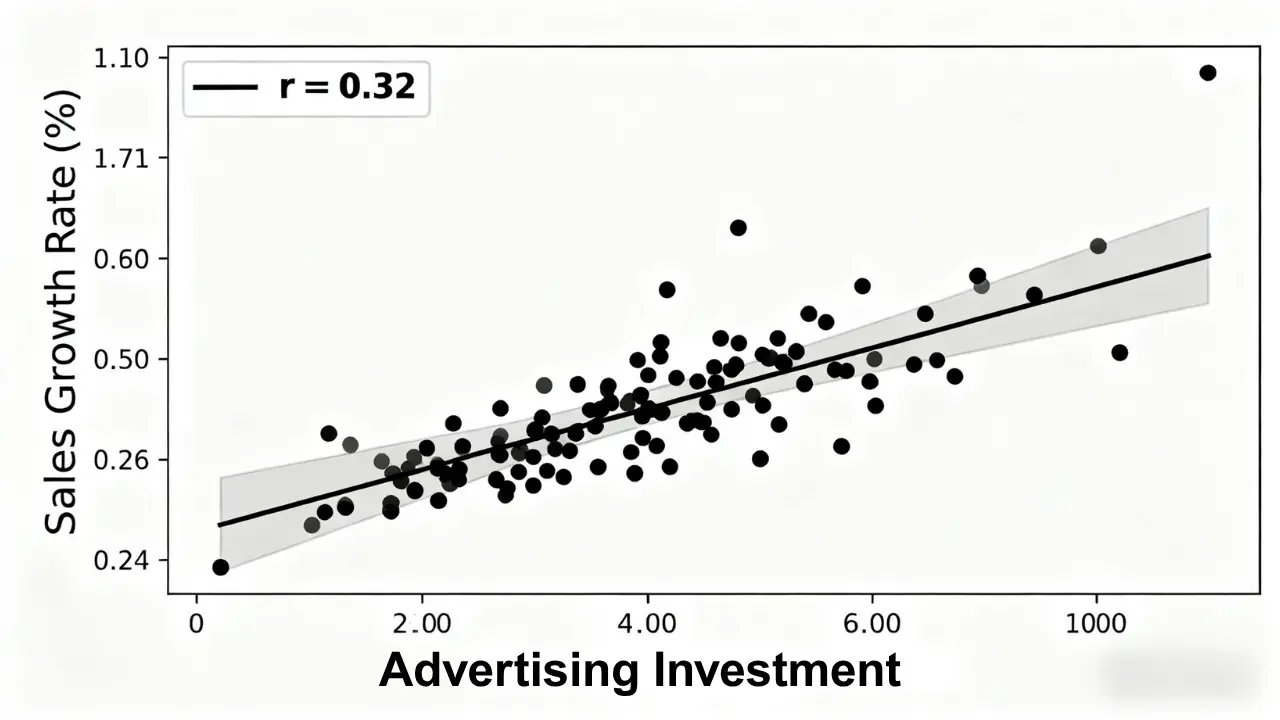
Statistics and Data Analysis
Scenario: Studying the correlation between advertising investment and sales.
Usage: Scatter plots are used to observe the distribution patterns of points and calculate correlation coefficients.
Why: The focus is on "analyzing" relationships, not just "displaying" data.
Use graphs in labs, academic conferences, or technical discussions. It appears more professional and precise.
Best Tools for Creating Charts and Graphs
When dealing with data, we need to create charts or graphs to present information more clearly and intuitively. However, some people may be confused about how to create charts and graphs. Below is some information about creating charts and graphs.
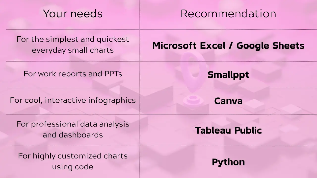
Here are some recommended tools for creating your own charts and graphs.
Here’s how to create charts using these tools.
Office Software (Best for Beginners and Everyday Use)
These tools are likely already installed on your computer and offer the easiest way to create charts.
Microsoft Excel / PowerPoint / Word
Advantages — They’re familiar to most people, easy to use, and include a wide range of chart types. They integrate seamlessly with the Microsoft Office suite.
The downside is that they have limited advanced visualization features.
How to do it:
- Enter your data in Excel.
- Select the data range.
- Click the "Insert" menu -> choose the type of chart you want.
- Generate your chart with one click, then adjust colors, styles, and other settings.
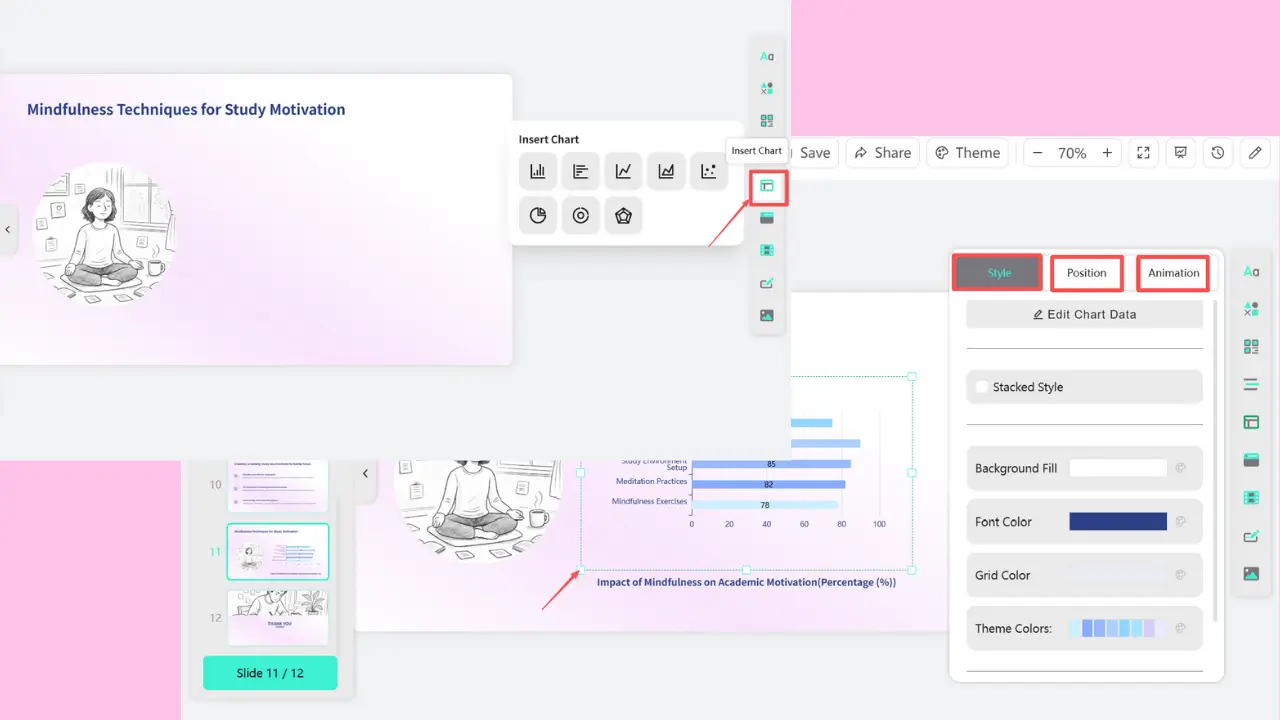
When presenting data, we often create charts or graphs to make the information clearer. If you’re creating a report or presentation, you can insert charts directly in Smallppt. You can adjust the inserted charts online.
FAQs: Chart vs Graph
Q1. What is the difference between charts and graphs?
A chart’s main purpose is to display and communicate information clearly. A graph’s main purpose is to show and analyze relationships between variables.
Q2. When should charts and graphs be used?
Use a chart when the context involves a report, presentation, dashboard, marketing materials, a press release, or when explaining to non-technical audiences. Use a graph when you’re working on things like data analysis, algorithms, scientific research, graph theory, network structures, mathematical models, or correlation analysis.
Q3. What tools can be used to create charts/graphs?
You can use Microsoft Excel, Canva, or Smallppt.
Q4. In specific contexts, which is more appropriate to use: a chart or a graph?
In the office, say 'chart' when talking to your boss or colleagues. This is always correct and fits the business context best. In a lab, academic conference, or when discussing with engineers, say 'graph.' This sounds more professional and precise. When in doubt, use charts. Chart is a more general term focused on communication and covers most everyday use cases.