
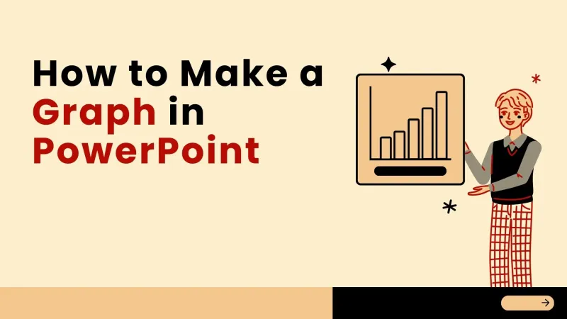
Graphs and charts form a key component in data-driven presentations - in general, complex numbers are visual stories that people can grasp in minutes. Microsoft's Work Trend Index indicates that data-oriented presentations are three times more likely to attract people and twice as convincing as text-heavy slides. Whether you are writing a business report, sales pitch, or academic project, do you know how to make a better graph in PowerPoint?
PowerPoint has robust graph tools, but nailing details like chart type and design prevents clutter. Below is a 5-step tutorial for pro graphs, plus tips. Busy non-designers can use AI tools to create presentations for efficiency.
Why do we need a chart in our presentation
Simplify complex data
Charts are able to transform dense tables, raw numbers, or abstract trends into simple-to-grasp graphics, such that a reader can extract key information in seconds instead of wasting a few minutes decoding text.
Boost Engagement & Retention
Visual information is more appealing than plain text. A well-designed chart can draw the audience’s attention, not overload them, and preserve important information before the presentation.
Enhance Argument Credibility
Charts give objective, visual evidence for your claims (growth, market share, cause-and-effect, etc.) that can help you make it easier for your audience to believe in your claims.
Step-by-Step Guide: How to Make a Graph in PowerPoint (5 Core Steps)
Follow these steps to obtain a clear professional graph in PowerPoint by Microsoft, practices, and suggestions from presentation pros.

Step 1: Navigate to the Insert Tab
Open your PowerPoint presentation and click on the bottom of this slide. Choose Insert and hit Chart on your slide. In any modern PowerPoint urn you can click on.
Step 2: Choose the Right Graph Type

A pop-up window with chart types (Bar, Line, Pie, Scatter, etc.) and previews. The graph type representing your story:
- Bar/Column Graphs: Ideal for comparing data across categories.
- Line Graphs: Perfect for showing trends over time.
- Pie Charts: Great for displaying part-to-whole relationships.
- Scatter Plots: Use for analyzing correlations between two variables.
Most business papers use bar or line graphs, which are easy to read and not confusing to visualize. Click OK for a placeholder graph and linked Excel spreadsheet (see next).
Step 3: Input and Edit Your Data

When you add a graph to your Excel sheet, you will see the information in the form of placeholder data. Replace it with your real data:
- Type your categories (e.g., “Q1, Q2, Q3”) in the leftmost column.
- Enter your values (e.g., “15000, 22000, 18000”) in the rows to the right.
- Add or delete rows/columns to match your dataset—your graph will update in real-time.
Paste special > Paste Link. If your data is already in an Excel file, copy it directly into the linked sheet. If the data changes frequently, copy your Excel file in the next frame (click “Paste Special > Paste link” after copying).
Step 4: Customize the Graph Design

Look at your graph in a way that mimics your presentation using PowerPoint’sChart Design and Format (in the form of tabs in the following:
- Change Colors: Use the “Change Colors” button to match your brand palette or presentation theme.
- Apply Styles: Choose a pre-built style to add professional touches (e.g., borders, shadows) with one click.
- Add Labels: Click the “Chart Elements” icon next to the graph to add axis titles, data labels, or a legend—these are critical for clarity.
Avoid overcrowding: We set colours to 3-4, avoid irrelevant effects (e.g., 3D rotations) that distort the data.
Step 5: Optimize for Readability
Fill your graph with the ease that you will read from a distance (in-person presentation):
- Use large, bold fonts for axis titles and labels (minimum 12pt).
- Ensure high contrast (e.g., dark text on light backgrounds)
- Resize the graph to fill most of the slide—leave 1-2 inches of white space around the edges to avoid clutter.
- Delete redundant elements (e.g., gridlines that don’t add value) to keep focus on the data.
Save Time with Smallppt’s AI-Powered Graph Generation
While PowerPoint's graph tools are powerful, hand-picking chart types, graphic styles, or layouts can be time-consuming—especially for non-design pros or those on tight deadlines.
Enter Smallppt: an AI PowerPoint maker that leverages Generative AI to automatically build and generate graphs and charts. Here’s how it works: upload your raw data (text, Excel file, or even a link), and Smallppt will analyze it to select the optimal graph type (bar, line, pie, etc.), then produce a presentation-ready graph that matches your slide theme—no manual formatting required.
You've spent hours creating PowerPoint graphs and never come up with messy or confusing graphs. Download your data, run your generative AI from scratch, make your graph with professional quality, and focus on what matters: providing a convincing presentation. Get a free trial now to generate your own charts, 1000+ presentation templates, and cross-device editing without design skills with this AI PowerPoint maker.
FAQs About Making Graphs in PowerPoint
Q1: How do I choose the right graph type for my data?
Be careful: compare bar/column graphs for comparisons, line graphs for trends, pie charts for part-to-part relationships, and scatter plots for correlations. Avoid tripping 3D charts or radar graphs – they usually distort data.
Q2: Can I update my PowerPoint graph if my data changes?
Yes! Copy and paste your graph into an Excel file. The Excel graph will run automatically for unlinked graphs. Use Click Data and update the pop-up.
Q3 Can I import Smallppt-generated graphs into PowerPoint?
Absolutely. Smallppt allows you to export graphs (and presentations) as.pptx files (all versions of PowerPoint). You can print your graph in SmallppT, export it, and open it in PowerPoint when you want to make some final changes.
Q4: How do I avoid making my graph look cluttered?
Allow colors to 3-4, keep a clean font, do not fill with gridlines/legends, and keep labels short. Label data out (i.e., Q1-Q2 instead of months) if you need too many points to be busy.
Q5: Do I need design skills to make a professional graph in PowerPoint?
No! PowerPoint’s styles and Smallppt’S AI tools are designed by you. Take care of your data, and Smallpst will auto-generate sharp graphs with your presentation theme - no design experience needed.