
In today’s fast-paced business presentations, academic reports, and educational lectures, data visualization has become one of the most effective yet cost-efficient tools for capturing audience attention and clearly communicating complex information.
PowerPoint has long been the go-to tool for creating charts, whether you need to present sales trends, research findings, or project progress. A well-designed chart not only simplifies dense data but also makes your presentation more engaging and easier to remember.
This guide will walk you through the complete process of creating and optimizing charts in PowerPoint, while also sharing professional tips to help you avoid common mistakes.
PowerPoint Chart Types (Selection Guide)
PowerPoint offers a wide variety of chart types to meet different data visualization needs. So what types are available, and how do you choose the right one? By reviewing the following categories, I will teach you how to decide:

1. Pie Charts
Pie charts are suitable for displaying data that can be divided into proportions or percentages, such as market share distribution across 3 to 5 categories. They are not recommended for datasets with more than 5 segments, as they become difficult to read.
In addition, this chart type is not suitable for showing trends. Pie charts cannot represent change or progression over time.
2. Bar Charts / Column Charts
Bar charts and column charts are ideal for discrete data, such as comparing quarterly sales across regions or team performance metrics. They can show certain trends and are visually simple, making them suitable for most datasets. It is worth noting that Smallppt can automatically generate bar charts for your slides, meaning you do not have to create them manually, functioning much like a PowerPoint generator or AI PowerPoint maker.
There is, however, a difference between the two. Column charts are better for vertical comparisons, while bar charts work better in horizontal layouts, especially when category names are long.
3. Line Charts
Line charts are a classic data visualization tool and are best suited for showing changes and trends over time, such as monthly website traffic or progress within a specific month. Their lines clearly reveal patterns and movements.
However, for other types of data, such as proportions or categories, line charts are relatively weaker compared to other chart types.
4. Scatter Plots / XY Charts
Scatter plots display the relationship between two numerical variables through the distribution of individual data points. They are commonly used to show correlations, such as the relationship between advertising spend and revenue.
The limitation of scatter plots is that they only handle 2 numerical variables and can only demonstrate correlation, not causation.
5. Area Charts
Area charts can be seen as an advanced extension of line charts. By adding filled areas beneath the lines, they emphasize total volume or scale changes, such as cumulative user growth over a year.
Their drawbacks are also clear. With multiple datasets or in unsuitable scenarios, area charts can quickly become hard to read.
6. Other Types
There are also more specialized charts, such as radar charts for comparing multiple metrics of a single subject, histograms for showing frequency distributions, and waterfall charts for tracking cumulative changes. Although these charts are less common, they can be highly effective in the right context.
- One rule of thumb is that clarity always comes before complexity. Before choosing a chart type, ask yourself one question: what story do I want the data to tell? Then select a chart that communicates that story at a glance.
Step-by-Step Guide to Creating Charts in PowerPoint
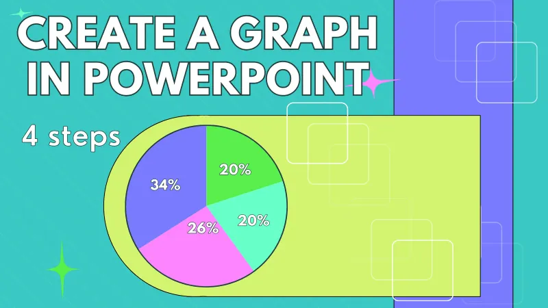
Although charts may look sophisticated, creating one in PowerPoint is not difficult. Follow the 4 core steps below to build a chart easily. I will also explain how to further optimize the design through customization:
Step 1: Select a Slide and Open the Chart Tool
1. Open your PowerPoint presentation and navigate to the slide where you want to insert a chart.
2. Click the Insert tab at the top ribbon.
3. In the Illustrations group, click Chart.

Step 2: Choose a Chart Type
1. A dialog box will appear showing different chart categories.
2. Select a chart category from the left panel.
3. Preview specific styles in the right panel.
4. Click OK. PowerPoint will insert a sample chart and open an Excel sheet for data entry.

Step 3: Replace the Sample Data with Your Own
1. PowerPoint will open an Excel worksheet where you can replace the sample data with your actual data.
2. Once you close the Excel window, the chart in PowerPoint updates instantly.
3. If you need to adjust the data later, right-click the chart and select Edit Data to reopen Excel.

Step 4: Customize Chart Elements and Styles
You can adjust the following settings based on your preferences or slide theme to better align the chart with your presentation:
1. Change Design and Theme
Select the chart and go to the Design tab. Choose a preset theme or variant to match the overall presentation style. You can also adjust colors, fonts, and effects, similar to what a modern AI PowerPoint maker or PowerPoint generator would automatically handle.

2. Change Chart Type
Right-click the chart and select Change Chart Type to switch to a different style.

Practical Tips and Common Mistakes

1. Keep Charts Simple
Avoid cramming too much data into a single chart. If you have a large dataset, consider splitting it into multiple charts or using a combo chart.
2. Label Charts Clearly
Never omit chart titles, axis labels, or legends. In an ideal scenario, the audience should understand the chart without additional explanation.
3. Smart Excel Data Integration
If your chart data needs frequent updates, you can copy the charts directly from Excel and use Paste Special in PowerPoint, selecting Link Data. This way, when the Excel data updates, the chart in PowerPoint updates automatically. More detailed steps can be found in the referenced article.
4. Choosing the Wrong Chart Type
Chart selection is the first step. Using a pie chart to show changes over time or a line chart to display proportions will confuse your audience. Always evaluate your data carefully before deciding.
5. Missing or Vague Chart Titles
Using a title like Sales Data is too generic. A clearer option would be Sales by Region in Q1 2026, which provides immediate context.
6. Axis Scale Settings
Unreasonable axis settings can mislead trend interpretation, such as starting the Y-axis at 50 instead of 0. Always use logical and consistent scales to support accurate understanding.
Final Thoughts
Once you master the ability to create high-quality charts in PowerPoint, adding data visualizations to your slides will no longer feel like a challenge. Improving presentation impact becomes straightforward.
Whether you are preparing a client report, a scientific presentation, or a classroom lecture, choosing the right chart type and following clear steps will help you transform raw data into compelling visuals.
To further improve efficiency, you can also rely on AI tools like Smallppt. It can automatically add charts to your slides, saving you time and effort, much like a built-in PowerPoint generator and AI PowerPoint maker.
Now it is time to put this guide into practice. With consistent practice, you will soon be creating charts at a professional level.